Archives For INTERIOR DESIGN CLIENTS

Sarah’s House Currently

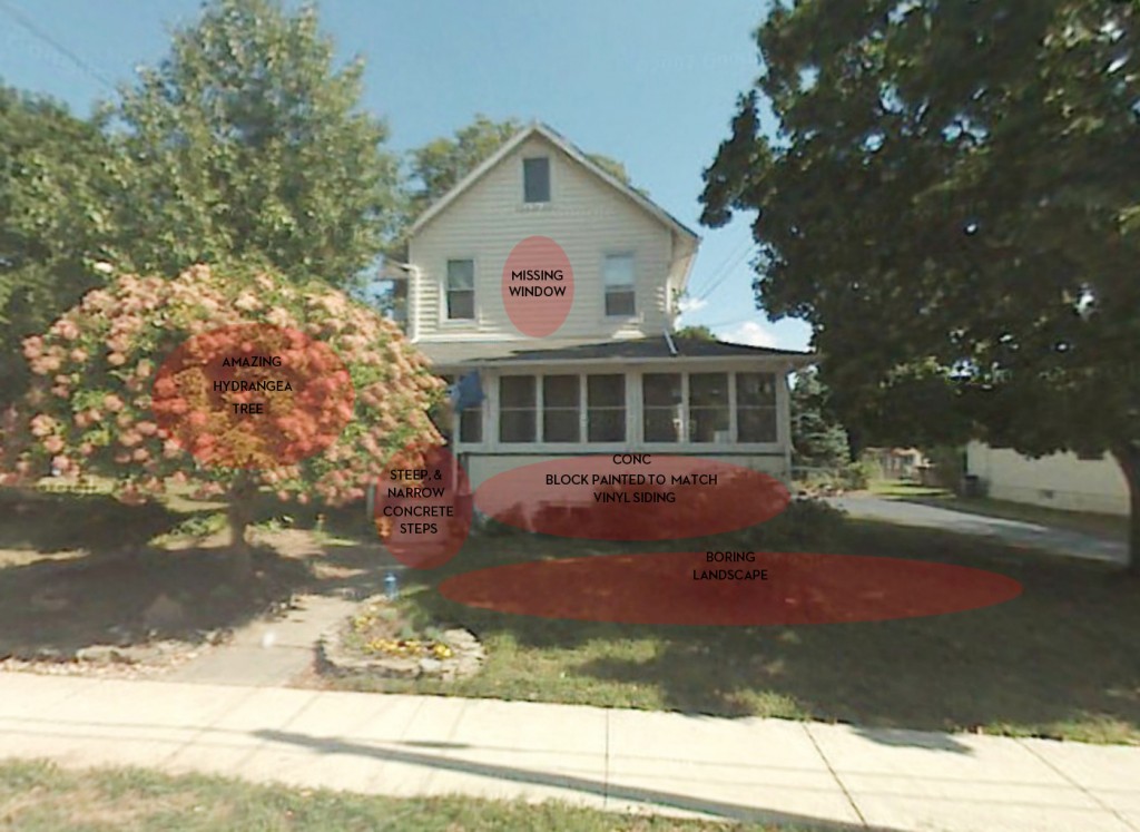
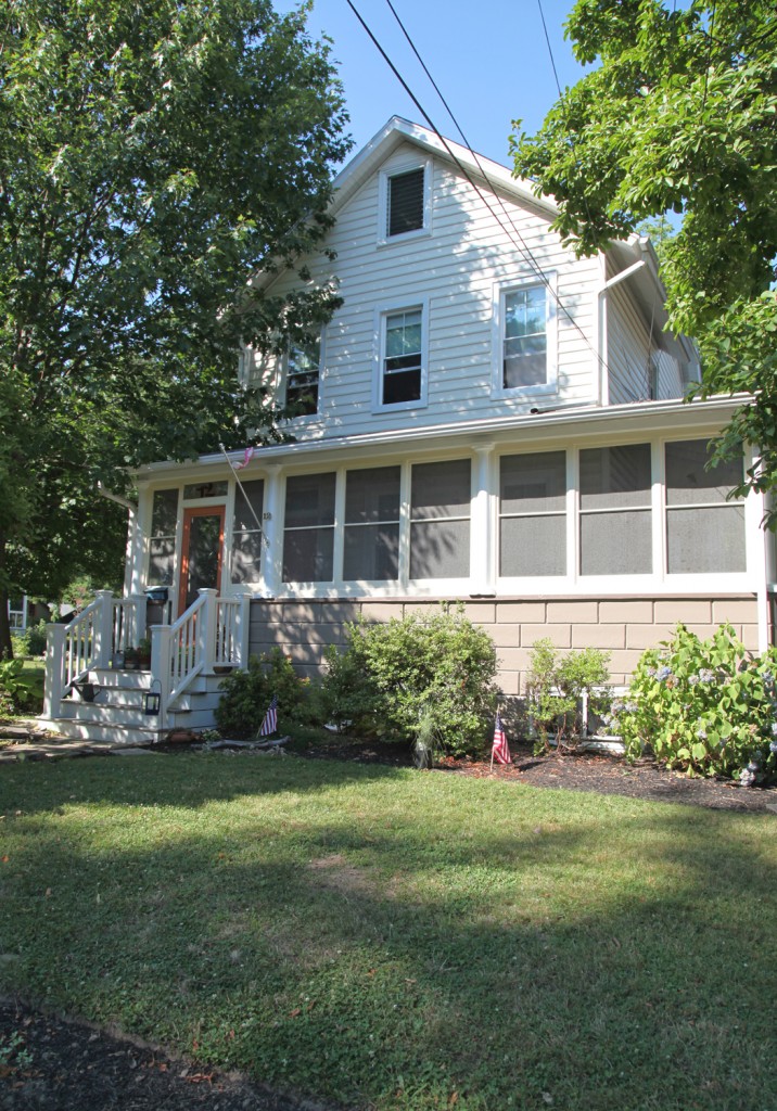
I first spoke to Sarah about her front steps last year when we were working on her bathroom. She was looking for low maintenance, pretty front steps to replace her old steep concrete steps.  We then had a few discussions about her front yard and steps over the past year. We tend to have periodic discussions on and off about things before a decision is ultimately made, with some pinterest thrown in for good measure. Although once she makes up her mind, she is all in, which I really admire. Below are the main issues that needed to be addressed on the front of house to give it the curb appeal that it deserves.

Sarah’s House before with Areas for Improvement

Areas for Improvement

1. Front Steps: The old steps were not only not very attractive but they were also not very safe. She was looking for low maintenance. When we first talked she was thinking about slate. The problem with slate in this part of the country is that it needs to be resealed frequently and you can’t use salt on it. They are also quite expensive and require a lot of construction work and digging. Then we discussed more of a “porch” look but she didn’t want to be repainting it frequently. After several months the idea of trex decking came up. She liked that idea a lot. So I went to look for inspiration. Here is where I started:
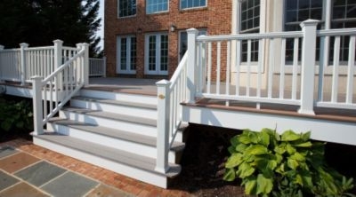
From Trex
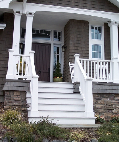
Fortunately Trex and several of the other manufactured wood products have come a long way. They now offer railing options with hidden fasteners and nice detailing. It is not cheap, the material cost is 2-4 times the cost of wood, but it won’t require maintenance, which in a southern facing location like this would be frequent. Fortunately Sarah was looking for a simple gray flooring and white railing and vertical pieces, which are standard colors.

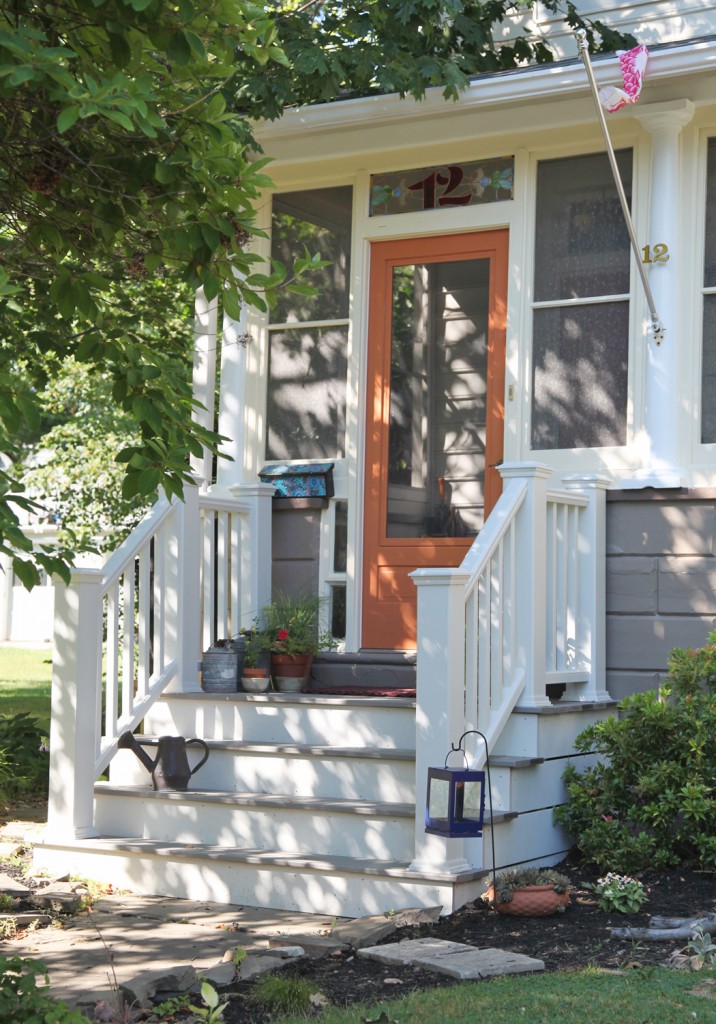
Sarah’s Front Porch

We designed the stairs to fit comfortably in board of the two adjacent columns. This gave enough space to have a comfortable landing along with space to accessorize. Fortunately Sarah was quick to add some lovely details like a couple of vintage watering cans and some bright annuals.

2 Paint: The house has lovely round columns, but they were in need of scraping, patching and paint. They were painted the same color as the surrounding trim, so they disappeared into the screened porch. Also the concrete block front 0n the existing porch was painted the same white as the columns and trim with a strange green stripe on top. I thought this brought too much attention to the block, which I wanted to be more recessive. Also a darker color would help ground the house, have it blend with the screens above and provide a better backdrop for the new plantings. The main body of the house has vinyl siding in a creamy white-yellow. It is fairly new (installed by the previous owner) and in good condition so it had to stay so the color palette had to work with it.

New Paint Color Scheme

The cream (Cream Puff from Behr was used on the columns) now works with a color palette that is more interesting and cohesive. The bright white adds a nice freshness, along with the light pumpkin colored door. Meanwhile the warm gray grounds the house just like I hoped. This will make a nice backdrop for the new plantings.

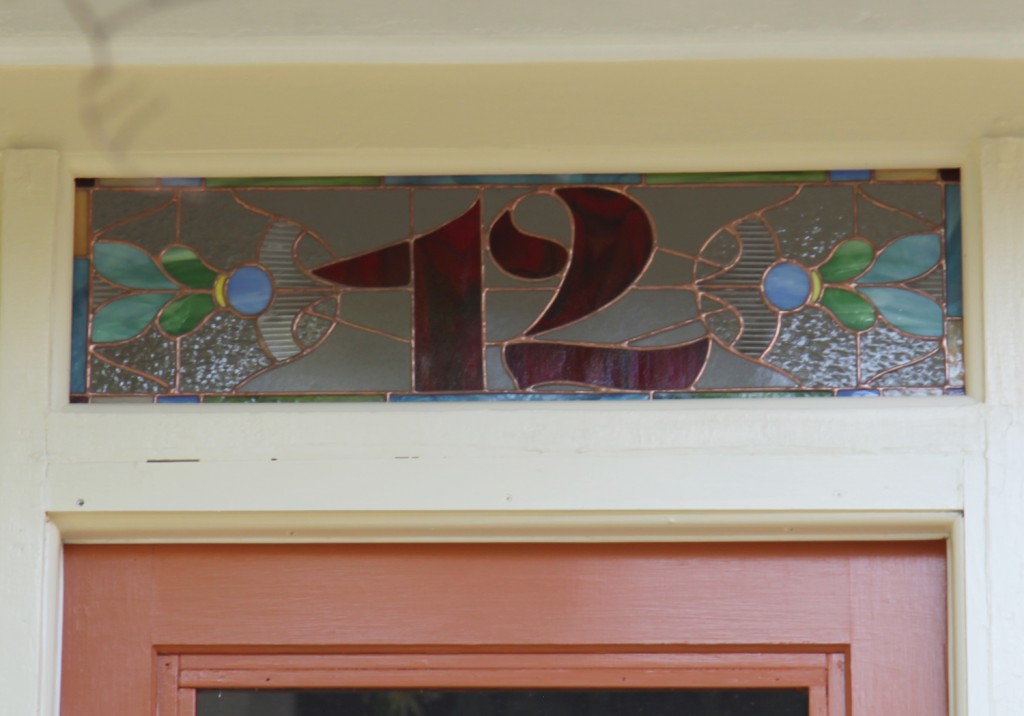
3. Windows: The previous owner added new vinyl siding over some old and dilapidated diamond asbestos shingles. This was an improvement, but installed less than ideal vinyl windows. Sarah has since replaced the windows that face the front with a higher quality window with historically accurate 2 over 1 pattern. While she was at it, she added the long missing middle window on the second floor. This made a major improvement to the front facade. She also had an artist design new stained glass numbers for above the door.

New Stained Glass Above the Door

I really like that the glass style has hints of Victorian but paired with a more modern font style.

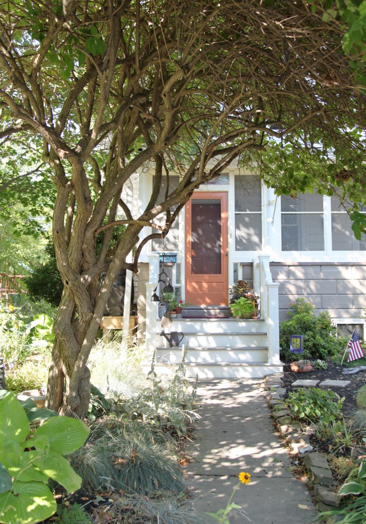
4. Plantings: Sarah has also been spending the summer slowly removing grass in the front yard to create a lovely cottage garden. She was fortunate to start off with a stunning hydrangea tree. It frames the front entrance and adds so much character. It has to be at least 40 years old.

Sarah’s New Front Entrance w/ Hydrangea Tree

She is infilling with a mix of classic cottage perennials such as hollyhocks, daisies and coneflowers. She is also mixing in some grasses, which give nice volume when the perennials are not in bloom. Her shade garden under her hydrangea also has a lovely mix of hostas, ferns and shade loving low grasses.

The curb appeal on her house has gone through the roof and I smile whenever I pull up.

I hope everyone has a great weekend and stays cool! We are not looking forward to the heat and will most likely be hiding inside.

Leave a comment

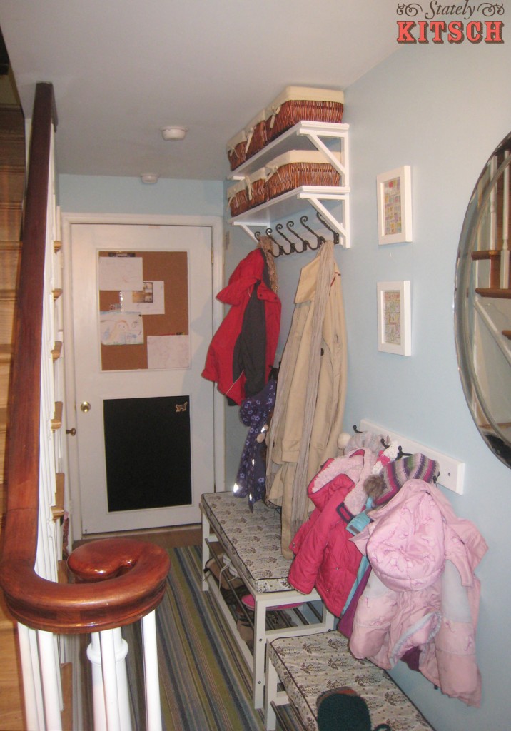
Hallway w/ New Hooks, shelves, benches, mirror, trim, cork board & chalkboard

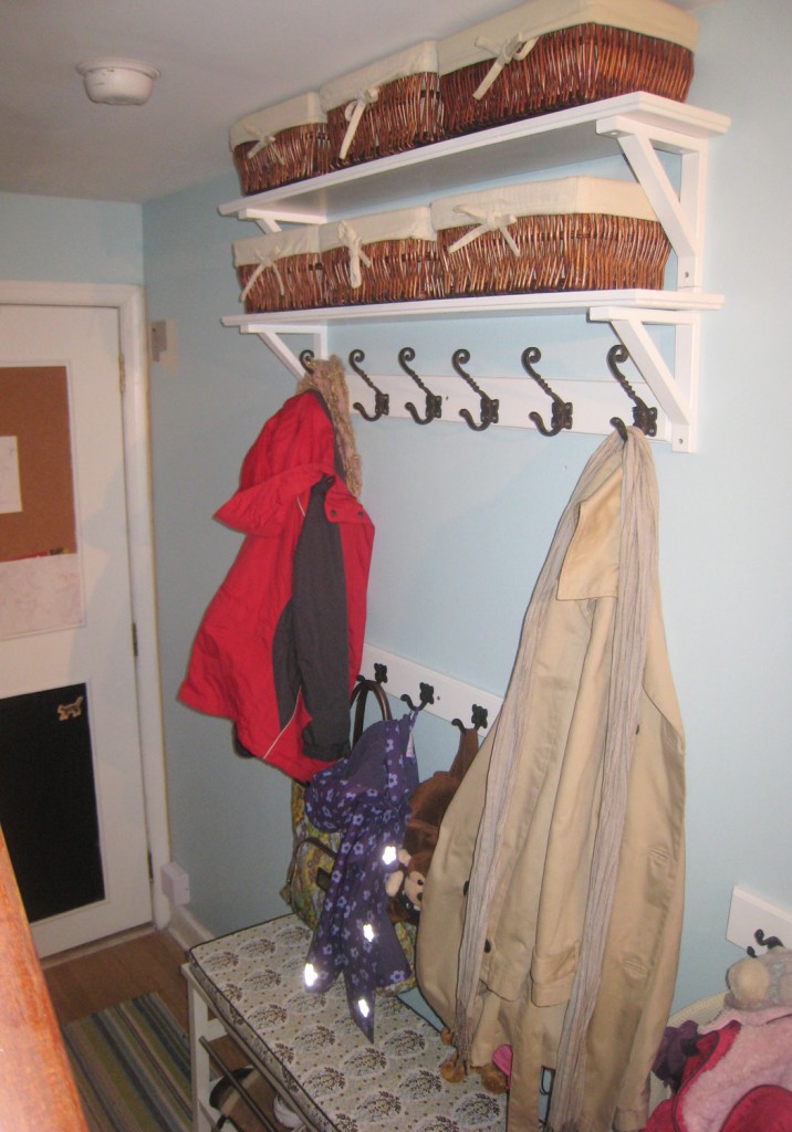
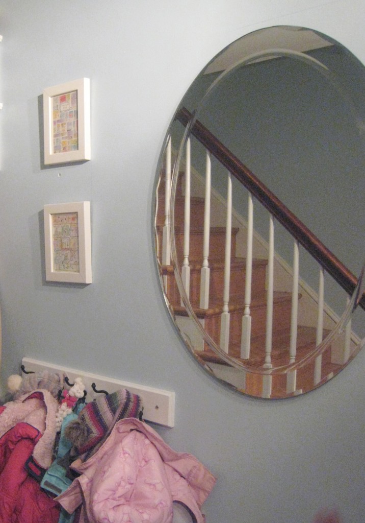
I was over at Zdenka’s house last week to start talking about her Living Room. While I was there I checked in on the front hall, which I am happy to report is being very well used! The shelves and mirror are  up. She and Zafar painted the trim and installed the chalkboard paint and the cork board. Zdenka also finished sewing the cushions for the benches. They came out beautifully! The only change was that the mirror had to be moved over because when mounting it they hit a duct in its original location. It actually works well to the side and she added a couple of pieces of art next to it. Next on the list are a couple of small cubbies for mail at the back of the space (narrow enough to fit with the door to the utility room open) and framing up family photos in white frames to hang going up the staircase.
Hallway w/ new Shelving, Hooks & Baskets (Large Hooks are the Mudroom hooks, $8 from Anthropologie)

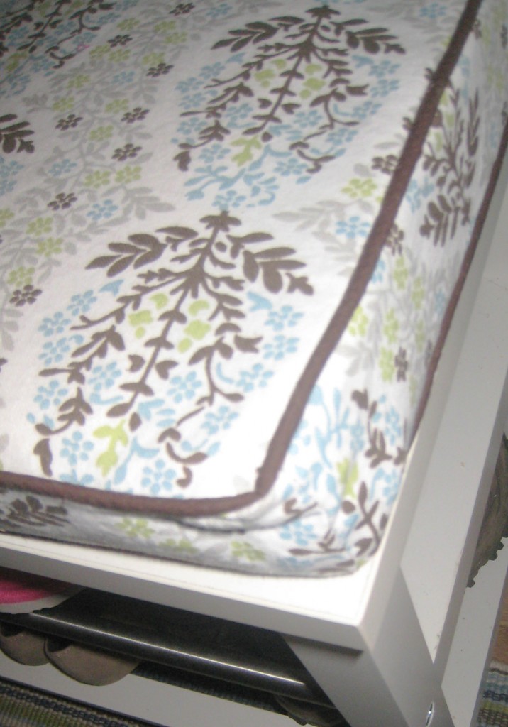
Bench Cushion w/ Brown Piping sitting on Tjusig Bench ($59.99) from Ikea. Fabric is Robert Allen Mandala Azure ($17.98 a yard from Fabric.com)
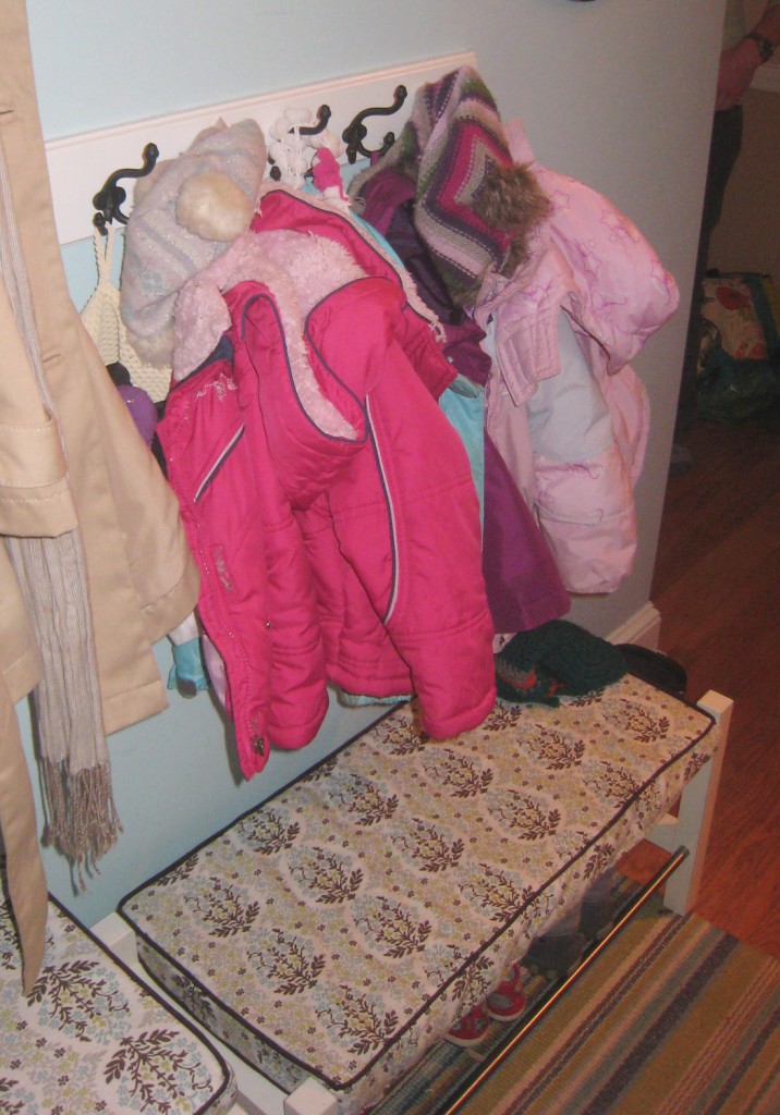
Kids Bench: This is the small Tjusig shoe rack from Ikea ($39.99) that we used as a short bench for the girls to sit on.

New Oval Mirror helps to soften the space (Aldo from Overstock, $95.99)

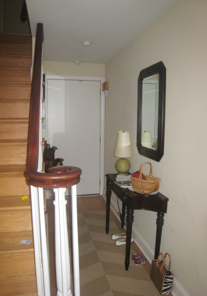
So as a reminder here is where we started:

Before

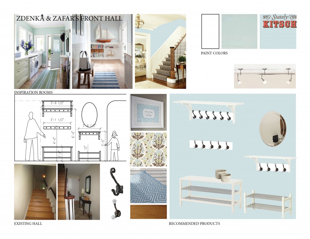
And here is Original Mood Board:

Mood Board

*To see all of the hallway posts click here.
**To see more of the selections that we considered click here to see the pinterest page.

Leave a comment

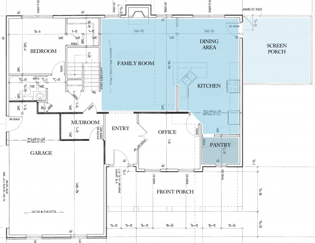
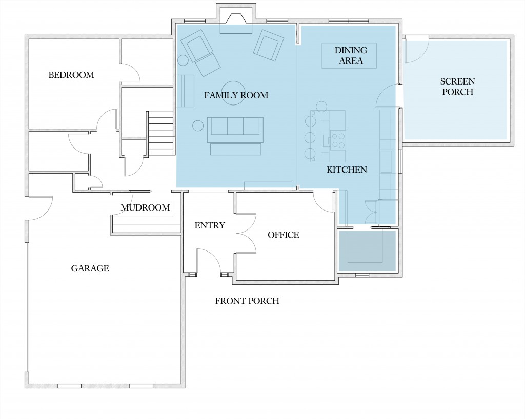
Original First Floor Plan: Blue Denotes Main Family Living Spaces

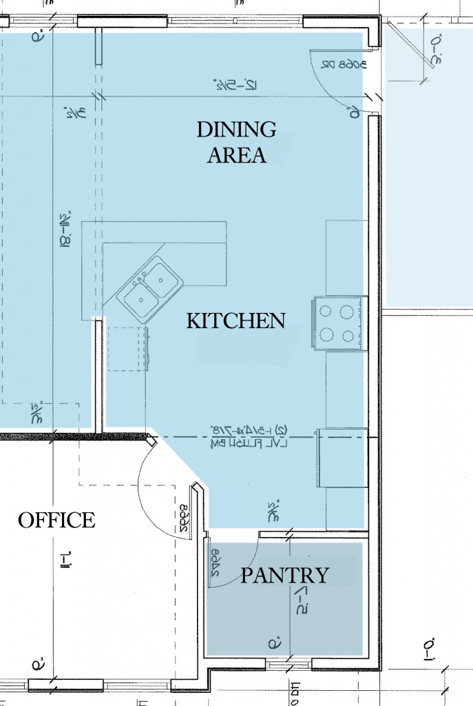
Laura and Ken picked out a lovely open floor plan for their cape cod style house. I like the mix of a more traditional house (and who doesn’t love dormers?) with an open floor plan for modern living. The one thing that didn’t seem to make sense was the kitchen layout. Although open to the main living/family room, it still seemed separate and a little hemmed in, definitely designed for 1 person in the kitchen. Also the diagonal sink (which I am not generally in favor of) was causing us problems because it didn’t work very well with the farmhouse sink that Laura really wanted. But there was one really nice feature of the kitchen plan (that I am totally jealous of), the separate pantry. I feel like this is a major trend that we are going to see a lot more of (especially now that kitchens are being opened up into family spaces). A generous pantry to hold all of the stuff that you don’t want on display, but want close at hand. Even the latest kitchen on This Old House  is installing a large pantry.

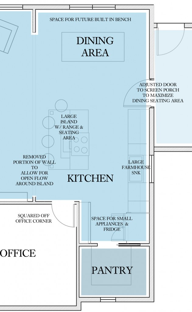
First Floor Plan After Kitchen Changes: Blue Denotes Main Family Living Spaces

Changes

-Removed the wall between the Kitchen and Family Room
-Removed the peninsula and angled sink
-Added a large island for seating and cooking
-Squared off the corner of the Office
-Created a shallow counter/cabinet area for small appliances (and a place to mount the microwave)
-Moved the sink to the outside wall and added a window
-Move the door to the Screen Porch to maximize dining seating
-The rear wall of this area was also pushed out 2′ feet to give them more space in the dining and family areas

Here is a side by side of the 2 kitchens:

Kitchen Before

Kitchen After

I really like how the plan looks now. I think the kitchen will feel much more open and light. Looking back at the original plan, I think it would have felt very dark with no windows and a lot of upper cabinets.

One of my favorite things is how well zoned the kitchen is now. It has 3 distinct areas.

Zone 1: Main open cooking and seating area. The person cooking and using the sink is in the main space.

Zone 2: The workhorse area where the small appliances and fridge are located. This area is still convenient but is not in the main line of view.

Zone 3: The pantry with the less used items. This is especially helpful when you have limited upper cabinetry elsewhere in the kitchen, as is the case here.

For the rest of Laura & Ken’s house click here.

2 Comments

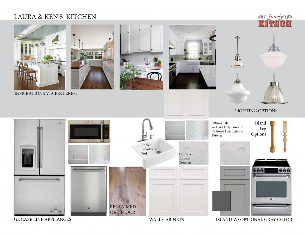
I have been working closely with Laura to make the kitchen just right. We actually did a pretty major redesign from the original builder plans and now have a more modern open kitchen design with a large island. If you follow me on Pinterest you will see that the board related to the kitchen is filled to the brim with ideas and products.

I will put up a separate post later this week detailing the layout, but in the meantime I thought I would show the current mood board. You will see that there are still things to be added and refined but you can start to imagine the feel of the kitchen. It currently has a very clean white and gray palette. Fortunately they are leaning towards using a contrasting reclaimed oak flooring for the whole first floor. This should really help to start to bring in some warmth.

Leave a comment

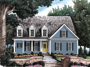
Rendering of Laura and Ken's House

Laura and Ken have narrowed down the exterior house colors and shingles, so now it is time to focus in on the front door. The front door is such an important part of the house, it is not only where people first come into the house (and wait while you open the door) but it is also something that you touch. I have a general rule that the closer something is to you, the better the quality should be. So in our case the door is important. The style also sets the mood for the house. Fortunately now doors come in all different shapes, sizes, glazing and colors. I am a fan of a bright colored door to welcome someone!

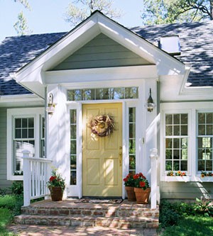
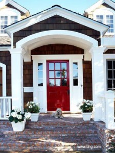
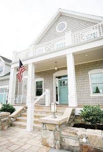
Here are a few that I found via Pinterest:

1. Yellow door w/ transom and sidelites

2. Red door w/ sidelites

3. Aqua Door w/ transom & sidelites

1.juztimage.com  via pinterest 2. bhg.com via pinterest 3. houseofturquoise.com via pinterest

Since we were looking primarily in the gray range for the house, we looked at 3 colors for the door: yellow, red and blue/aqua. All would pop against the gray house and white trim. Once we decided on a painted door instead of a natural finish, it then turns to deciding on what type of door. Their builder recommended Therma-Tru, which is one of the largest manufactures of doors in America. Fortunately they make a fiberglass entry door system, which is great for several reasons. Fiberglass is quite strong but unlike steel doors it won’t rust and doesn’t require a thermal break. It should stand up well to lots of use without getting dings and it also takes paint well and doesn’t expand and contract like wood. It also helps that the options in fiberglass are quite good now! They also offer the complete system with the sidelites and transom (glass above the door), so that will help to make sure that the joints are tight which will help keep the weather out. Another option  for fiberglass doors is Jeld-Wen but I couldn’t seem to find sidelites and transoms on their website.

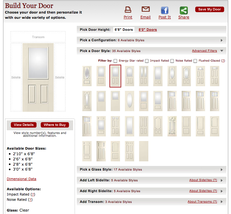
Here is the configurator options for the Therma-Tru Smooth Star Entry Door Collection:

Therma-Tru Smooth-Star Door Configurator

As you can see the options are quite extensive, from traditional to arts and crafts and ranging from no glass to almost all glass. They also offer a more traditional panel look or a beadboard style.

After reviewing the options, Laura and Ken selected a model with more glass, to help bring light into the space. They are fortunate and the entry is a double height space, so they can take advantage of the light from transom above the door.

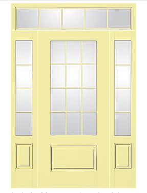
Therma-Tru Smooth-Star Door: One Panel 3/4 Lite w Sidelites & Transom painted a creamy yellow

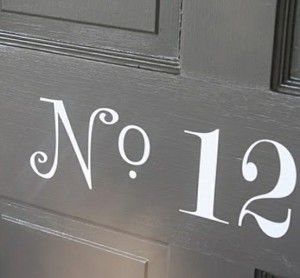
I think it will be very welcoming! I would finish it off with a number like this in paint or vinyl (idea originally from the first issue of Blueprint Magazine) in black just below the glass.

Vinyl House Number

Image from Holly Mathis Interiors

Leave a comment

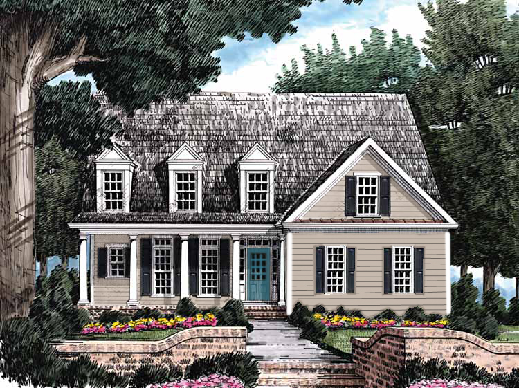
Rendering of House w/ Tan Siding and Blue Door

I have been working on an exciting new project here! Laura and Ken are building their dream house. They have the plans and the builder and have already broken ground, but they need some help with the details and product selections. So I have been helping to guide them through all of the choices. Today I thought I would show the options for the exterior cladding. The house is Cape style with 3 lovely dormers and a front porch. They would like to use pre-finished Fiber Cement Siding for the exterior. This is a great choice because the fiber cement wears extremely well, doesn’t rot and holds paint better then wood. Additionally the pre-finished siding choices come with a warranty on the finish, including fading, so the house will look great for years to come.

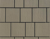
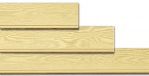
Staggered Edge Shingle from James Hardie

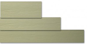
Straight Edge Shingle from James Hardie

We started by looking at James Hardie shingles but now have expanded the search to include Certainteed as well. We are also reviewing the choices in siding styles including shingles and clapboard/lap/plank siding.  The advantage of looking at both is not only to compare costs, but to get a wider variety of color choices. When we had our house re-sided a few years ago we chose the Certainteed smooth lap siding to match the original wood clapboards, but couldn’t find a prefinished color to our liking, so we ended up having to have it painted, but it would have been more cost effective and quicker to install if we had used a prefinished product.

SIDING STYLES


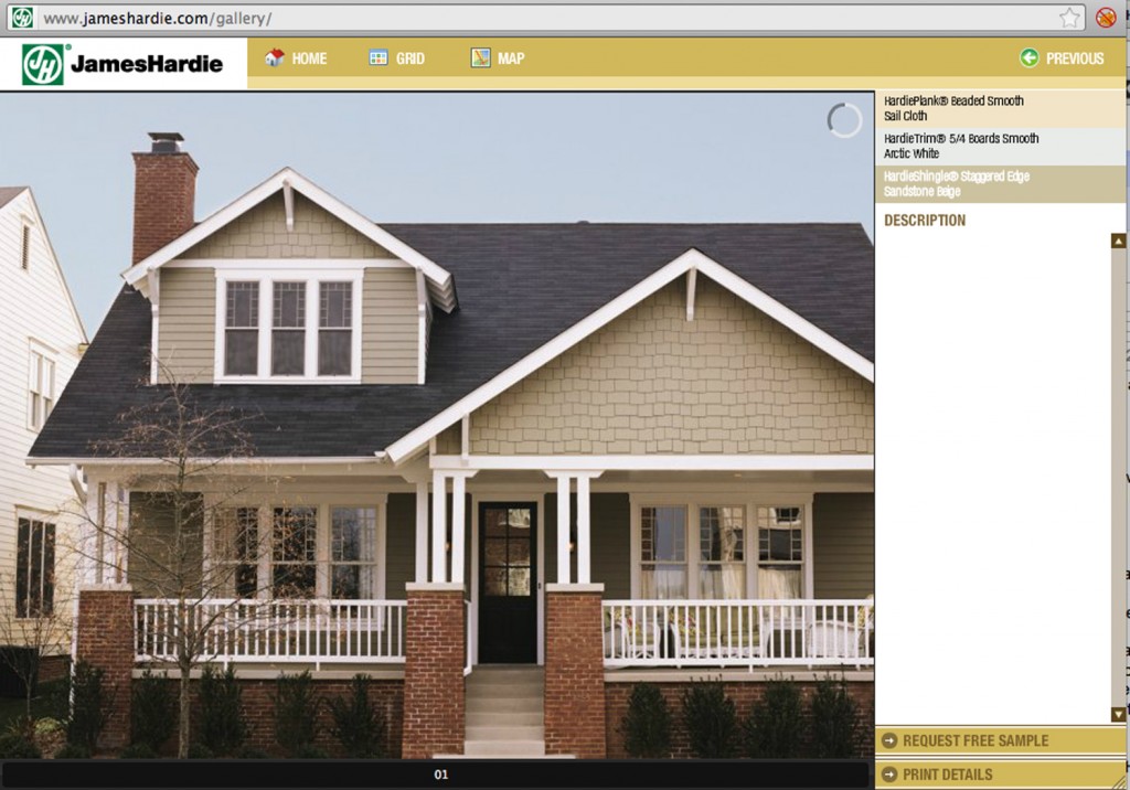
Staggered Edge Shingle in Eaves w/ Clapboards on main body in Sandstone Beige (from James Hardie)

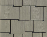
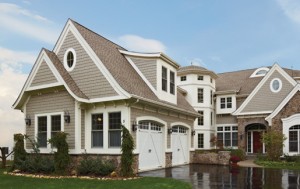
Random Square Staggered Edge Shingle in Pewter w/ PVC trim (from Certainteed)


Shingles

Shingles have been used on houses in America for hundreds of years. Unlike clapboards they tend to have a more rough hewn appearance, often with the wood grain being visible. Traditionally I think of them being used in New England and in beach homes. Cedar shingles are a favorite in salt air climates, as they withstand the rigors of the weather better than a clapboard that has to be painted frequently.  “Shingle style” architecture had a big resurgence at the end of the 19th Century to contrast the ornate patterned siding of Victorian architecture and to pay homage to the traditional colonial homes.Typically shingles will be more noticeable then a clapboard, since the pattern and texture are more irregular.

Both James Hardie and Certainteed make a straight and staggered edge shingle in the prefinished product. The shingles are more expensive then the clapboards due to the patterning. Both companies also offer fancier half round and octagon shingles for victorian style houses as well as board and batten.

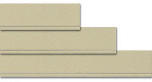
Beaded "Smooth" Clapboard

Beaded "Cedar" Clapboard

"Cedar" Lap Siding

"Smooth" Lap Siding

"Cedar" Finish Clapboards in Sandstone Beige (from James Hardie)

"Smooth" Finish Lap Clapboards in Wicker (from Certainteed)

Clapboards

Clapboards have been traditionally used for hundreds of years. Unlike shingles which were rough, clapboards traditionally required milling to create straight and even pieces, creating a finer profile. In fiber cement shingles both companies offer a traditional lap and a beaded lap (which has a “bead” on the bottom). They also both offer them in a smooth or a wood grain, textured or “cedar” appearance. I prefer the smooth finish in this product and a lapping in the 6″-8″ range. I also think that the beaded detail gives a nice added touch of detail.

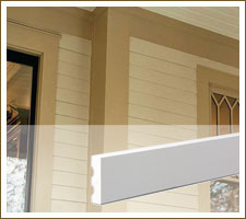
Fibercement Trim from James Hardie

Fiber Cement James Hardie Trim


Trim

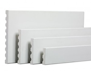
I think that trim is one of the most important aspects of the exterior. If the trim doesn’t look right proportionally I think the rest of the house will not look its best, no matter what type of siding you use. I often think that is why vinyl siding often looks cheap, it isn’t the larger sections of siding, it is the thin trim that often has unsightly joints. For Laura and Ken’s house there are 2 options for trim. One is fiber-cement trim, which both manufacturers make. The other is a solid PVC trim which Certainteed makes as does Azek. In their case I would recommend sticking with the fiber-cement. Larger Fiber-cement trim boards did not exist until recently. We used PVC our our house. My main complaint with the PVC is that its expansion and contraction rate is quite high. Meaning on longer runs (over 15′), you will have joints that will open and close depending on the season. Laura and Ken do not have long runs on their house, but I am still not totally sold on the pvc, especially when fiber cement is now available. I also like sticking with the same material where possible since the texture will match and it will take paint the same way. The fiber cement trim are also available in prefinished which is great. For their house I recommend using a nominal 8″ wide board (typically 7.25″) with a 1″ or 1 1/4″ thickness. This will frame the house nicely and the white trim will contrast with the body color. If you notice, most of the pictures above have thick substantial trim.

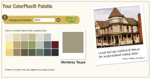
James Hardie Color Palette

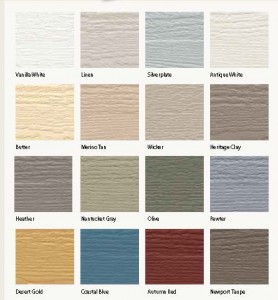
Certainteed Color Palette

Color

Both James Hardie (ColorPlus) and Certainteed (ColorMax) offer quite a few prefinished colors. However, I often find it is difficult to find just the right color, especially when you will be living with this color for the next 20 years.  For both companies you have to give them your zipcode so that you can figure out what “zone” you are in. Different colors are available in different regions of the country.

So far we have been looking in the gray to blue range for Laura and Ken’s house with white trim. The 2 colors that they are considering from James Hardie include Monterey Taupe (warm gray with a hint of green) and Boothbay Blue (a medium blueish gray). From Certainteed they are considering the Silver Plate (lighter gray) and Pewter (a blueish gray). Of all of the colors I have seen in pictures my favorite is the Pewter, although I would like to see the sample in person. Which one is your favorite?

James Hardie Boothbay Blue

Certainteed Pewter

Up Next:

The front door choices.

4 Comments

Front Hall Progress

Zdenka and Zafar are already busy using their new front hall. Since I last posted about this project, we carefully measured the hook locations (making sure her coats and purses would fit correctly) and I routed out some wood backer pieces for the hooks then they painted them and screwed the backer pieces into the studs. Not only does this provide a much stronger base but it gives it a more polished appearance. There are still shelves to be installed above the hooks for extra storage. But today I was over installing some miscellaneous trim around the space to help spruce it up. Their new Dash and Albert rug has also arrived.

New Trim for existing shelving under the stairs.

The new trim (to be painted white) should tie in nicely with the white shelves, benches and back boards and should really help make the space feel fresh especially against the blue walls.

Front Hall Progress with items still to be installed

Next on the list is to paint all of the trim white and add the cork for the top area of the door (with fabric over it) and chalkboard paint to lower area of the door. Zdenka is also working on the seat cushions for the 2 benches.

Brushed Nickel Track Lights from Pottery Barn

Since I was there last the electrician also installed the new track lights for the space, which really helps brighten the space and make it a lot easier to find what you need.

Small Hooks for the Kids Stuff

Anthropologie Hooks

I am also still in love with the cast iron “mudroom” hook from Anthropologie and the small hooks we found for the kids.

I think this is the smallest room I have worked on, but it such an important space. It has been a challenge making the best use out of a few square feet. It is great to already see it in use and I can’t wait to see it when it is all complete!

Leave a comment

Kitchen Accessories

Andi and Neil are busy using their new kitchen, BUT we still need to add some color punch! We have agreed on the William Morris inspired fabric for the window valance. We all love their persimmon colored Fiestaware, and I would recommend adding some more decorative Fiestaware pieces but I’ve tried to round out the room with some additional accessories. I am trying to mix some more classic style with some fun retro design to marry the more traditional house with Andi and Neil’s more eclectic style.

1, 2 & 3 Prints by Handz on Etsy: $19-21 a piece for A3 Size (11.7×16.5)

4. Print by Tidbits Photography on Etsy: $15 for 8″x10″

5. William Morris Inspired Fabric for Window Valance: Sweet William in Teal, $9.95 a yard. We are going to do an inside mount so as not cover the millwork.

6. Utensil Kitchen Towel: Frukost Dishtowel, Flatware on Anthropologie $18. This would also be really cute framed or as cafe curtain.

7. Inspirational color palette: Superneutral Decorating Palettes on Martha Stewart.com. We have been using this for reference since the beginning of the project.

8. & 9. Persimmon Fiestaware on Ebay.

10. Colorful Coffee Mugs: Modernist Mugs at West Elm, $10 a piece

11. Pretty Foodie Calender: Mini Foodie Calender by Tidbits Photography $14

12. Hanging Glass Planters: Shane Powers Hanging Glass Bubbles at West Elm $9-24

13.  Owl Measuring Cups in Coral: West Elm $19 a set

14. Beautiful Olive Wood Paddle Cutting Boards: West Elm $19-39. I think this would a nice contrast to all of the straight lines.

15. Red Biscuit Tins: West Elm $9-16

1 Comment

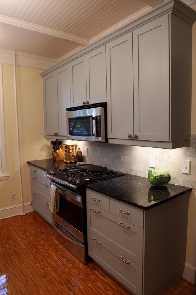
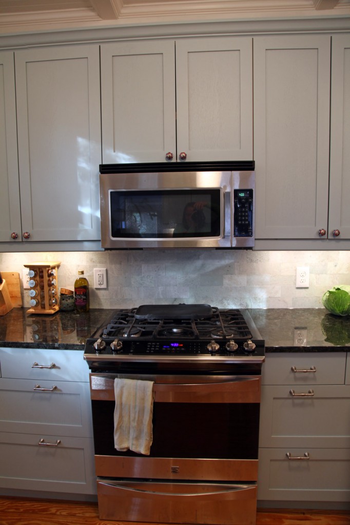
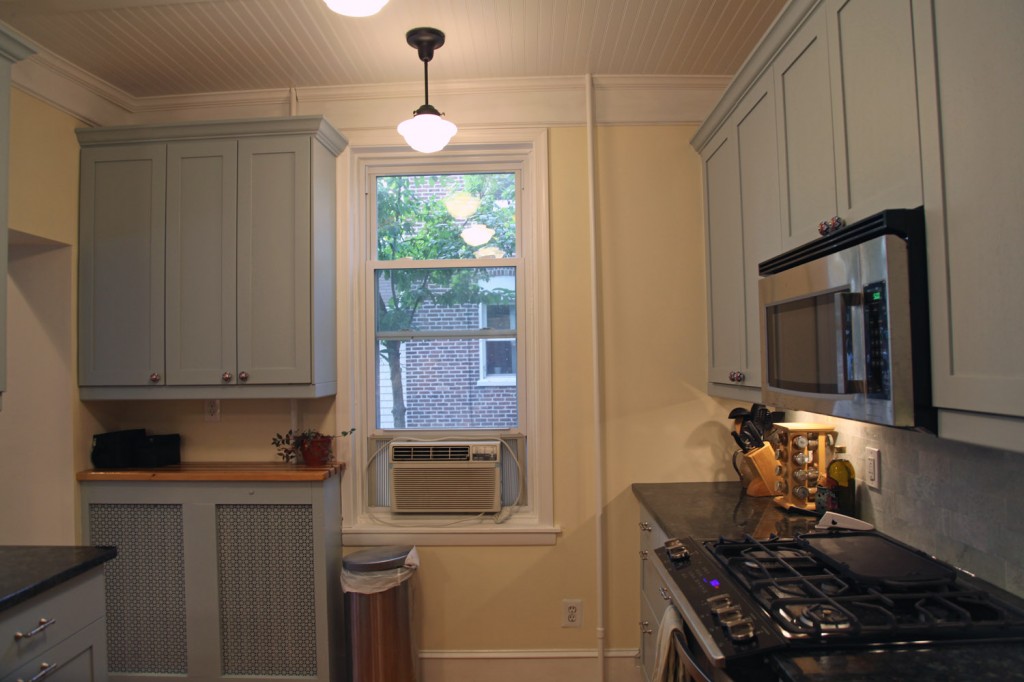
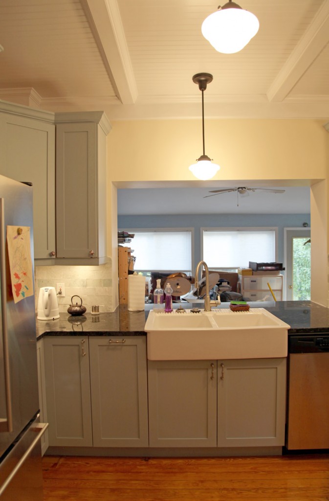
I stopped over Andi and Neil’s house on Tuesday to see how everything looked. The contractors finished up on the previous Friday so they are officially up and running! We still have to work on accessories and a window valance. After that I will actually have a photo shoot. In the meantime I know that there are some people anxiously awaiting to see how it came out. I don’t think Ikea cabinets have looked this good in a while. So without further ado…

North Wall with marble tile backsplash

North Wall, with new gas range and mircowave. You will also see the beautiful "Ming" Marble tile. The contractor installed these super tight, so there isn't a grout joint to clean.

West Wall (window valance still needs to be added). Custom butcherblock over the radiator cover

South Wall with new giant farmhouse sink. They had enough extra tile that they were able to tile the walls on either side of the sink as well.

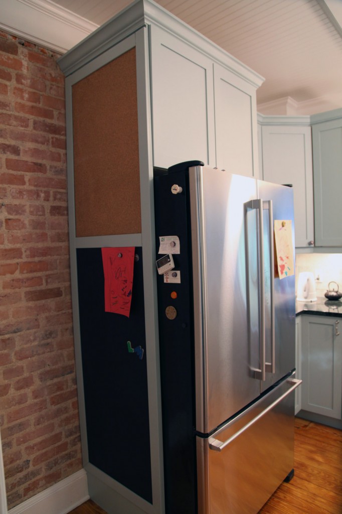
East Wall: Custom chalk and cork side panel. This unscrews from the inside in case they need to take it down to move stuff in and out of the basement. Andi also painted with a metalic primer under the chalkboard so that magnets will stick.

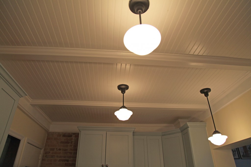
Beadboard and beam ceiling with schoolhouse lights

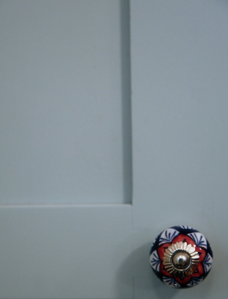
Detail of painted dovetail cabinet door with final knob

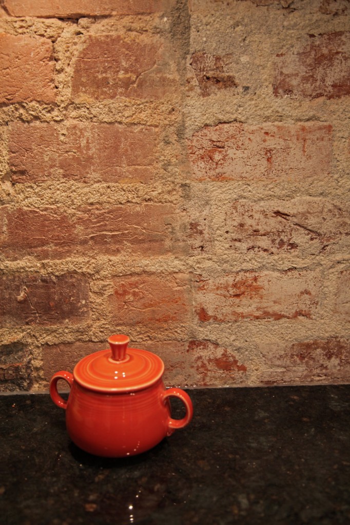
Existing Brick wall with granite counter and fiestaware sugar bowl

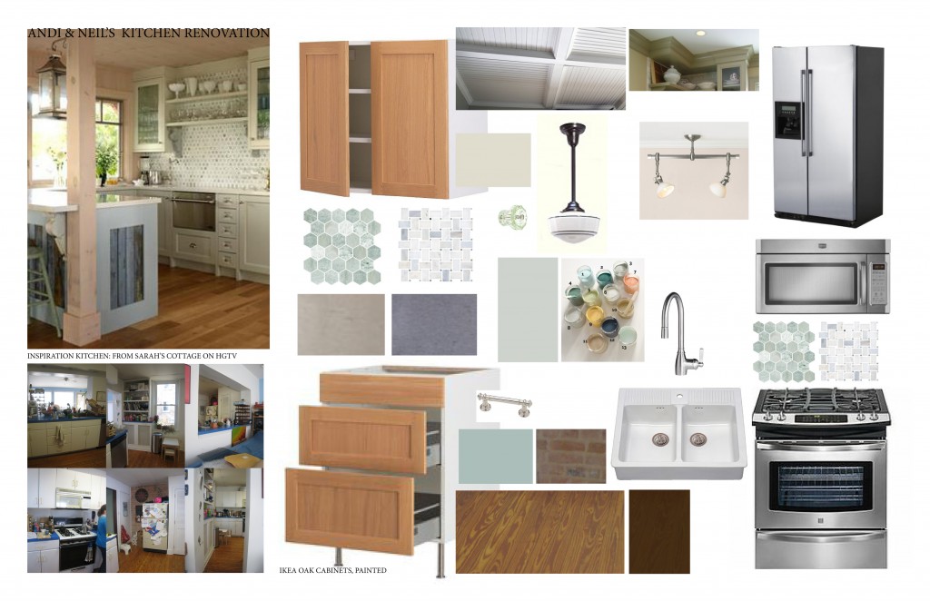
Original Mood Board

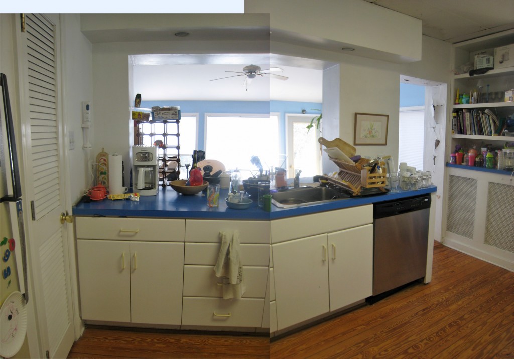
North and West Wall Before

South Wall Before

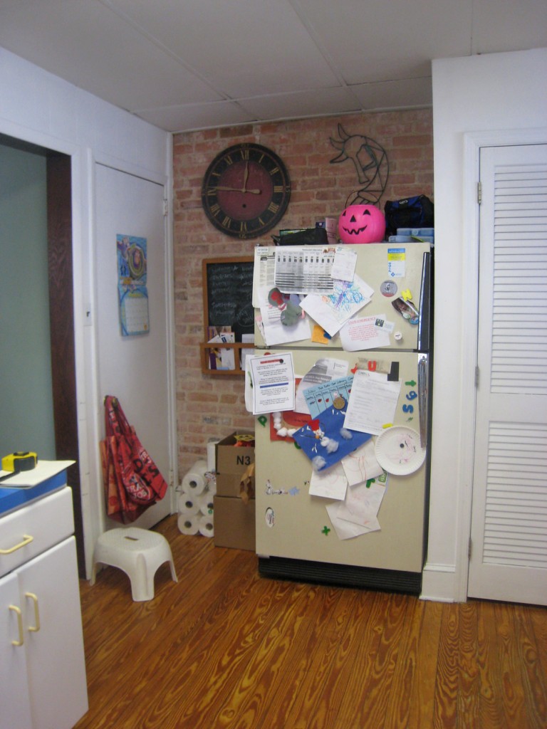
East Wall Before

P.S. Tomorrow I will have a post on some options for accessories for the space.

3 Comments

Mood Board: Early Fall

October 11, 2011 — 2 Comments

Early Fall Mood Board

I decided to take a mental break and put together a mood board for early fall.  I’ve been focused  a lot on work (both at work and at home) lately and have been feeling like I need to let my own style peek out a little more.

Kite Hill by Paul Octavious

First Snow by Paul Octavious

I am in LOVE with these 2 photos (Kite Hill & First Snow)  by photographer Paul Octavious available on 20×200 (each $50 for 11″x14″). I like the comparision of the 2 seasons but also the bits of color and whimsy of the children paired with the strong horizon. I used these as my jumping off point (which is kind of funny since it is currently fall not summer or winter). 

English Arm Chair by Hickory Chair

I next chose a comfy chair by Hicory Chair to contrast some of the brighter colors of the space. I love the beautiful “english arm” and deep leather, it is exactly what I want to sink into now that the weather has started to get colder.  I paired this with a beautiful pillow from Etsy that brings out the colors from the photographs but in a more sophisticated but still playful way. I also used a beautifully textured throw from Terrain but no longer available.

I decided to make the big pop of color on the floor. This is an amazing rug by Angela Adams. I have admired her use of pattern for some time but really like the texture and pattern of this hand tufted yellow rug. To continue with the texture and to contrast with the smooth leather of the chair I chose a paper-maiche side table by Stray Dog design for West Elm ($149). It is crafted out 100% recycled materials.

For the walls I chose a moody blueish gray painted on a textured wallpaper. I really like the concept of textured wallpaper, although only recently have more modern patterns been available. This one is from Graham and Brown. Finally I chose a curtain in a similar but slightly darker color and a nice heavy weight (West Elm, $29-69).

What do you think? Would you like to sit here and read a book?

2 Comments