
Original First Floor Plan: Blue Denotes Main Family Living Spaces
Laura and Ken picked out a lovely open floor plan for their cape cod style house. I like the mix of a more traditional house (and who doesn’t love dormers?) with an open floor plan for modern living. The one thing that didn’t seem to make sense was the kitchen layout. Although open to the main living/family room, it still seemed separate and a little hemmed in, definitely designed for 1 person in the kitchen. Also the diagonal sink (which I am not generally in favor of) was causing us problems because it didn’t work very well with the farmhouse sink that Laura really wanted. But there was one really nice feature of the kitchen plan (that I am totally jealous of), the separate pantry. I feel like this is a major trend that we are going to see a lot more of (especially now that kitchens are being opened up into family spaces). A generous pantry to hold all of the stuff that you don’t want on display, but want close at hand. Even the latest kitchen on This Old House is installing a large pantry.

First Floor Plan After Kitchen Changes: Blue Denotes Main Family Living Spaces
Changes
-Removed the wall between the Kitchen and Family Room
-Removed the peninsula and angled sink
-Added a large island for seating and cooking
-Squared off the corner of the Office
-Created a shallow counter/cabinet area for small appliances (and a place to mount the microwave)
-Moved the sink to the outside wall and added a window
-Move the door to the Screen Porch to maximize dining seating
-The rear wall of this area was also pushed out 2′ feet to give them more space in the dining and family areas
Here is a side by side of the 2 kitchens:

Kitchen Before

Kitchen After
I really like how the plan looks now. I think the kitchen will feel much more open and light. Looking back at the original plan, I think it would have felt very dark with no windows and a lot of upper cabinets.
One of my favorite things is how well zoned the kitchen is now. It has 3 distinct areas.
Zone 1: Main open cooking and seating area. The person cooking and using the sink is in the main space.
Zone 2: The workhorse area where the small appliances and fridge are located. This area is still convenient but is not in the main line of view.
Zone 3: The pantry with the less used items. This is especially helpful when you have limited upper cabinetry elsewhere in the kitchen, as is the case here.
For the rest of Laura & Ken’s house click here.


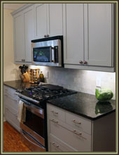


I can’t tell you how much this new layout makes me look forward to the house being done even more…I can’t wait to stand at the kitchen sink and look out into the woods.
Looking back on it, it seems really strange that the original plan didn’t have any windows on that wall. You are so lucky to have such a nice woods to look at! My parent’s house is on a nice wooded lot and my mom spends lots of time looking out her kitchen window.