Archives For ARCHITECTURE & DESIGN

The crane has been here for 10 minutes and they have already been up to the chimney and taken off the cap!

The Crane!

Getting Ready for the Crane

The day has finally come for the chimney lining! I’m so excited! The guys are here (the guys being DJ Cross Inc from Media).  They are waiting on the overdue crane (oh wait, now it is here!)

In the meantime they have taken down part of the back fence and are already down in the basement starting to work! Fingers crossed that all goes well. I will post pictures as they start making progress.

Also I have my plants safely tucked away in the compost pile (in the back right side of the picture).

Leave a comment

Octopus Print

Sea Urchin Print

Jellyfish Print


I wanted to find something interesting for the artwork for Sarah’s bathroom. I had octopus and sea creatures on my mind because of a beautiful Japanese octopus print that her daughter had hanging in her room. I also thought something with seashells would work with the iridescent accent tiles. So I did some searching around on Etsy. There were a surprising number of octopus prints to choose from. It appears that they are quite popular at the moment! Anyway after looking for around for a while I found the perfect fit; the sea creature prints of Ernst Haeckel.  I had never heard of him before but his drawings are very beautiful and also have a fantastic graphic quality. The colors also looked good with the room! I also discovered that several of his books are still in print. I had Sarah order up Art Forms in Nature: the Prints of Ernst Haeckel.  Now she can choose from the many beautiful prints in the book. We are currently planning on putting one above each hook. And the nice thing is that she can change these out and she does not need to worry if they get a little damp. There are also several Etsy vendors selling prints.

Leave a comment

The Living Room

April 7, 2011 — 2 Comments


Our Living Room is a very well used room. We don’t have a Family Room or a Play Room so this is it for hanging out, watching tv, playing with the kids and playing wii (with the kids). I have tinkered with the furniture placement a lot over the years. The current arrangement is designed to give the kids as much floor space as possible (and also allow for optimum wii playing).

The Stats:

The Built-in Bookcases and Mantle:

We built the bookcases that flank the fireplace about 7 years ago. We tried to match the style of the original 1888 mantel while keeping them fairly simple. The shelves on the bookcases started out being filled with vintage books! As the kids have gotten bigger and their toys have grown exponentially, we have been giving over more and more of the lower shelves to them. We built the shelves in 4 parts. The interesting thing is that although the widths of the spaces on either side of the fireplace were the same, the depths were not so each section is different. We also had to avoid the window and radiator on the right side.We also added the crown molding, ceiling medallion and light fixture at the same time.

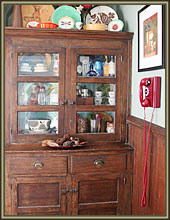
We have always collected kitschy nicknacks and we try and show them off and think they offer a nice contrast to the formality of the fireplace mantel and shelves. As a bonus the kids toys fit right in!

And next week if all goes well we will have new gas logs in the fireplace! The chimney guys are scheduled and fingers crossed the weather will cooperate!

Artwork & Accessories:

We use to collect quite a bit of artwork (mostly prints). Artists in the Living Room: Tim Biskup, Charlie Harper, Gary Baseman, daVE and Chank. Let me know if anyone wants a more detailed list.

We also have a lot of smaller things around the room that make us feel at home. The piggy banks on the dresser are for the kids. The monkeys were a gift before we had kids and use to sit there by themselves. The mirror is vintage from ebay.

The rug is from Ikea (about 8 years ago).

Furniture:

The Dresser: We always seem to get questions about our dresser/desk. No it isn’t an antique. It is a reproduction with lots of inlaid wood. The top opens to form a small desk. My mom and I picked it up at an auction years ago. The only reason I ended up with it is that my dad thought it was really ugly. Oh well, their loss is our gain.

The Striped Chair: This is an 18th century antique that my husband inherited. We had it reupholstered in Paul Smith fabric from Maharam.

The Plaid Chairs: From Crate and Barrel. I don’t think they make them anymore. I like that they are small but comfortable.

The Couch: Old and comfy. From the long defunct furniture.com. The funny thing about it is that we paid for it by reselling Bruce Springsteen tickets back when we lived in the City. The pillows are a mix of Thomas Paul and Pottery Barn.

The Ottomans: From Target. These faux leather ottomans are workhorses! They hold legos and blocks. The kids sit in them and on top of them. They jump off of them. They spill lots of food and drinks on them. Fortunately a little kitchen spray and they are as good as new!

The Kids Rocking Chairs: The red one is mine from when I was a girl. Apparently when I was about 2, I sat down in it in a toy store and wouldn’t get out of it until my parents agreed to take it home. I’m drawing a blank on the manufacturer of the brown rocking chair. Let me know if anyone wants me to look it up.

To Do List:

-Strip the radiators back to their original metallic appearance.
-Minor wall patching.
-Remove the red carpet and refinish the wood floor underneath.

2 Comments

The Kitchen

April 5, 2011 — 1 Comment

I’ve been really slow to take pictures of the inside of the house. It is probably because I always feel like nothing is ever finished. There are always more projects to do, but I have decided that I should give a mini house tour.  I can at least highlight the things I like about each room and what is left to do.  So without further ado here is the kitchen (aka the old Dining Room).

Favorite Things: I love the space and the light. It is really the center of the home. We both love to cook and this kitchen gives us lots of space to do that. I also love all of the color. We went fairly neutral on the cabinets but we went bright on the walls and with the accessories. I also love the soapstone countertops.

Things that Didn’t Fit: In order to make this room the kitchen, I was a little short on storage (partially because we have so few upper cabinets). I didn’t have enough space for a pull out pantry or a pull out garbage can. We use the old island in the basement for extra storage and I don’t mind having a freestanding garbage can.

Stuff left to do: Trim around the fridge, redo the front of the bench (where the kids have banged up the radiator grating and trim), and add some additional floor molding.

View from the sink. I love that I get to look at the old mantle and all of the funny tchockies and art we have collected as I do the dishes. The print is by Tim Biskup and the canisters are by Orla Kiely (for Target).

The mantle complete with vintage fireplace screen. The screen hides the litter box. The front hall is in the distance.

The vintage coat tree. The kids use the lower legs to hang their coats. The front hall is to the left. There use to be a door here to the closet (now the half bath).

The stove with a custom hood that we built. We had to change out the windows for smaller ones to make this work but I love how it came out. I can look out the window while I cook and the tile is beautiful.

The end of the island. This houses most of our cookbooks and our microwave. When I designed the kitchen I really wanted a place to hide the microwave and to store the cookbooks.

The window facing the backyard. There is a bench below that hides the radiator. It is a favorite place for the kids to sit. It is also nice to be able to keep an eye on the kids in the backyard and watch for my husband to come home.

The fridge. It is a standard fridge with a custom stainless steel frame (by Frigo Design). Inside the frame we installed thin boards with chalkboard paint. The kids love it! Now if I could just get to installing the last couple of pieces of trim on the side and top of the fridge.

1 Comment

Brooklyn Day at Terrain

Renato Poliafito from Baked

The Beautiful Lanterns!

Heucheras (Coral Bells) at the Entry

Succulent Balls, Very interesting!

Bird House with a Green Roof! I saw one like this at the Philadelphia Flower Show. I'm considering making one.

On Saturday, my friend Stacey and I decided to check out Brooklyn Day at  Terrain at Styer’s in Concordville/Glenn Mills, PA. We also wanted to see what kind of perennials and shrubs were on display (for ideas for her garden). I am going to write a second post on specific plants (stay tuned).  While we were there we got to meet the founder of the Brooklyn based bakery Baked, Matt Lewis and Renato Poliafito  Their second cookbook is out, and looks amazing. We also tried some delicious pickles and granola from other Brooklynites.  As usual there was lots of pretty stuff to see and lust after admire.

For anyone not familiar with Terrain it is worth a visit if you live in the Philly area. It is the brainchild of Urban Outfitters and Anthropologie founder Richard Hayne. Opened in 2008, it took over Styer’s Nursery (where I have been shopping for years). I had mixed feeling when it first opened, since I really liked the knowledgeable staff at Styer’s, but now I love it for its atmosphere (not to mention a delicious restaurant) and do lots of window shopping there, along with a little bit of actual shopping. Now it is a little harder to find a plant expert and the prices of some of the plants are overpriced, but they do have a beautiful selection of plants as well as garden pots, accessories and generally pretty items (and some pretty good sales). Also they offer classes and activities through out the year. Check out their calender.

1 Comment

Quoizel Sconce w/ glass shade, $138

The Sconce:

One of the first things we picked out for Sarah’s bathroom was this sconce. So beautiful and sparkly! We looked at several sconces including some plainer options but Sarah instantly loved this one. I like that there is a frosted glass diffuser to help soften the light at the mirror.

Heath Flushmount, Restoration Hardware, $149-$269

Overhead Light Fixture:

Finding a coordinating ceiling light proved more difficult than I was expecting.  I considered a small chandelier but almost none of them are UL rated for damp locations. For surface mounted fixtures, many manufacturers are not currently offering Chrome/shiny finishes  (it seems like rubbed bronze is the finish of choice). In the end we went with this simple but elegant fixture from Restoration Hardware. Although not cheap, it seems like a reasonable value to get the UL damp rating. I also wanted to avoid fixtures that have an open top above the diffuser. I find that these collect a lot of dust and bugs. A closed fixture should minimize this problem.

Good to know:

UL Rated Fixtures:

When you are picking light fixtures for the bath you really want a UL damp rated fixtures due to the humidity in the air. These will hold up much better in the moisture, particularly for a ceiling installations. Also for fixtures in the shower or above a bathtub you should pick a UL wet rated light fixture. The specifications for any light should tell you whether it is rated for this application.

Wall/Task Lighting:

-Ideally locate light fixtures on either side of the mirror at eye level. This will provide enough lighting around the face to avoid shadows.
-Use fixtures that have frosted diffusers/glass in front of the bulbs to soften the light.
-If you don’t have space on either side of the mirror consider a light above the mirror. In this case you are better off choosing a higher output fixture that lights upward so that the light will bounce off the ceiling and down. A direct downlight will tend to cast unflattering shadows.
-Consider separate switching and dimmers. For general use you don’t typically need a full strength light at the mirror, but for those times when you need that bright light to put on your makeup, you can adjust the light all the way up. Dimmers are economical because you are saving energy by reducing the power going to the fixture and also extending the life of your bulb. (Note: Not all bulbs are designed for dimming. Many florescent bulbs won’t work with dimmers).

General/Ambient Light:

-Use overhead ambient light for general illumination and to help balance the light from the task lighting.
-Again consider a dimmer for this application. These are especially nice at night when your eyes aren’t use to the bright light.

Additional Lighting:

-Consider a separate light in the bath/shower area. This should be UL rated for wet locations.

Leave a comment

Philadelphia Flower Show

March 23, 2011 — 2 Comments

For the first time in several years I had the opportunity to go to the The Philadelphia Flower Show. The show is pretty overwhelming. It includes elaborate displays from florists and landscapers as well as plants from local garden clubs. There is also a large area devoted to booths selling everything from fresh flowers to garden accessories to random knicknackery. The main reason I like to go is to look at interesting plant combinations, new varieties and trends. The theme this year was Springtime in Paris and it was nice to be inside the convention center on a drizzly winter day with a good friend!

Flower Carousel at the Center of the Flower Show

Trends

I noticed lots of circles and highlights of yellow and pink. I especially like the color combination of the yellow, aqua and green.

Floral Display w/ Aqua, Yellow & Green

Another Floral Display w/ round elements

Nice Yellow Urns


Plants

My favorite unexpected plant combination was the variegated Irises with the Heuchera (coral bells) and a soft moss ground cover. I also loved the short ground cover type tulips at one display. I think I will definitely have to get some in the fall to put into my garden. Brent & Becky’s my favorite bulb catalog sells several varieties. I also fell in love with the Pear Espalier. Too bad I don’t have a place to put something like this.

Varigated Iris (front) w/Heuchera & Moss

Lovely Pink Tulips mixed w/ perfectly placed oak leaves


Creamy Yellow Tulips

Pear Tree Espalier

2 Comments

American Standard Dual Flush Toilet, $267

As part of her bathroom renovation, Sarah is going to get a new toilet. No matter what toilet she chooses it will save quite a bit of water (estimates range from $50 to $100 a year in water/sewage savings) and  it will be more attractive. Old toilets can use as much as 7 gallons of water per flush. This was first lowered to 3.5 gallons and then in 1992 it was lowered to 1.7 gallons. When this first happened there were a lot of issues with low flow toilets. The good news is that now most low flow toilets work just fine. We have two 1.7 gallon toilets in our house and we haven’t had any issues. However now there are also a number of toilets that use even less water!

When I am designing institutional building we almost always use dual-flush toilets. These are toilets that have 2 option when you flush (1 for #1 and 1 for #2). The ones I use in institutional settings typically have a green handle (maybe you have seen this somewhere) and if you pull the lever up it uses about .7 gallons and if you push down it uses about 1.5 gallons.

In the last couple of years a number of residential dual-flush toilets have come on the market. Even Home Depot and Lowes carry some in stock. Unfortunately, not all of them have great track records. A number of architects and plumber recommend Toto (a Japanese company) for their low flow options. However I know someone who is not happy with hers, so I thought I would look at what else is out there.

For Sarah I selected the American Standard H2Option Siphonic Dual Flush Round Front Toilet. I found a few reviews that were generally positive and the price was about the same as for a nicer regular low flow toilet. For more extensive reviews from a plumber I recommend Terry Love’s website. He gives a rundown on a bunch of toilets.

Also look for the WaterSense logo from the EPA. This means the toilet uses at least 20% less water than the current guidelines of 1.7 gallons and has met a number of standards and tests.

Leave a comment

Striped Hook from Anthropologie

When first meeting with Sarah she mentioned that one of the problems in her current bathroom is getting her daughters to hang up their towels. I thought that given the limited wall space, we should try hooks. I think they give a nice updated look and you can fit more on a wall then you can with a towel rack. Plus it is easier for everyone to throw the towel on a hook then place it nicely on a towel rack.

I showed Sarah the hook from Anthropologie that I have been lusting over considering for my own front hall for over a year. I think it is very beautiful and a like the graphic pop of the stripe. The only downside to this particular hook is that the stripes are actually 2 different materials glued together, and it is recommended that you pick them up at the store where you can hand select them. I sent Sarah over to the store to pick them up and choose some knobs for the vanity. She selected a beautiful jewel toned glass knob.  Their selection of knobs is amazing! I bought all of my kitchen knobs from them.

Glass Knob for the Vanity


Leave a comment

Floor Tile

White Subway Tile

Glass Accent Tile: Studio E Edgewater Delmar

Tile Selections

The 2 items Sarah had chosen before I started working with her, where the floor tile and wall tile. However she hadn’t found an accent tile that she was happy with.

The Floor Tile:

The floor tile is a simple 12×12 in gray. We decided to work with this choice, since it is cost effective and will wear well. The grout will be in a similar gray color.

The Wall Tile:

For the wainscot and tub surround Sarah chose a simple matte white subway tile. I think this is an excellent choice. It is quite popular at the moment, but I think it has a nice timeless quality for a Victorian house like her’s.

The Accent Tile:

Sarah mentioned that she likes some of the glass tile she had seen, but wasn’t sure how to best use it. We also needed to find something in stock, to meet our tight deadline. I thought it would be nice to choose something a little bit different, since the rest of the wall tile is very neutral. I found this beautiful line of tiles at Home Depot online called Studio E Edgewater. This will be installed as a trim piece with 1 piece of cove subway tile above. To minimize cost a 1″ high tile was selected. I decided that a 1″x2″ would pair nicely with the larger (3″x6″) subway tile. There were several color choices that would work in the bathroom. In the end Sarah chose one that has a beautiful mix of blue and green.

Leave a comment